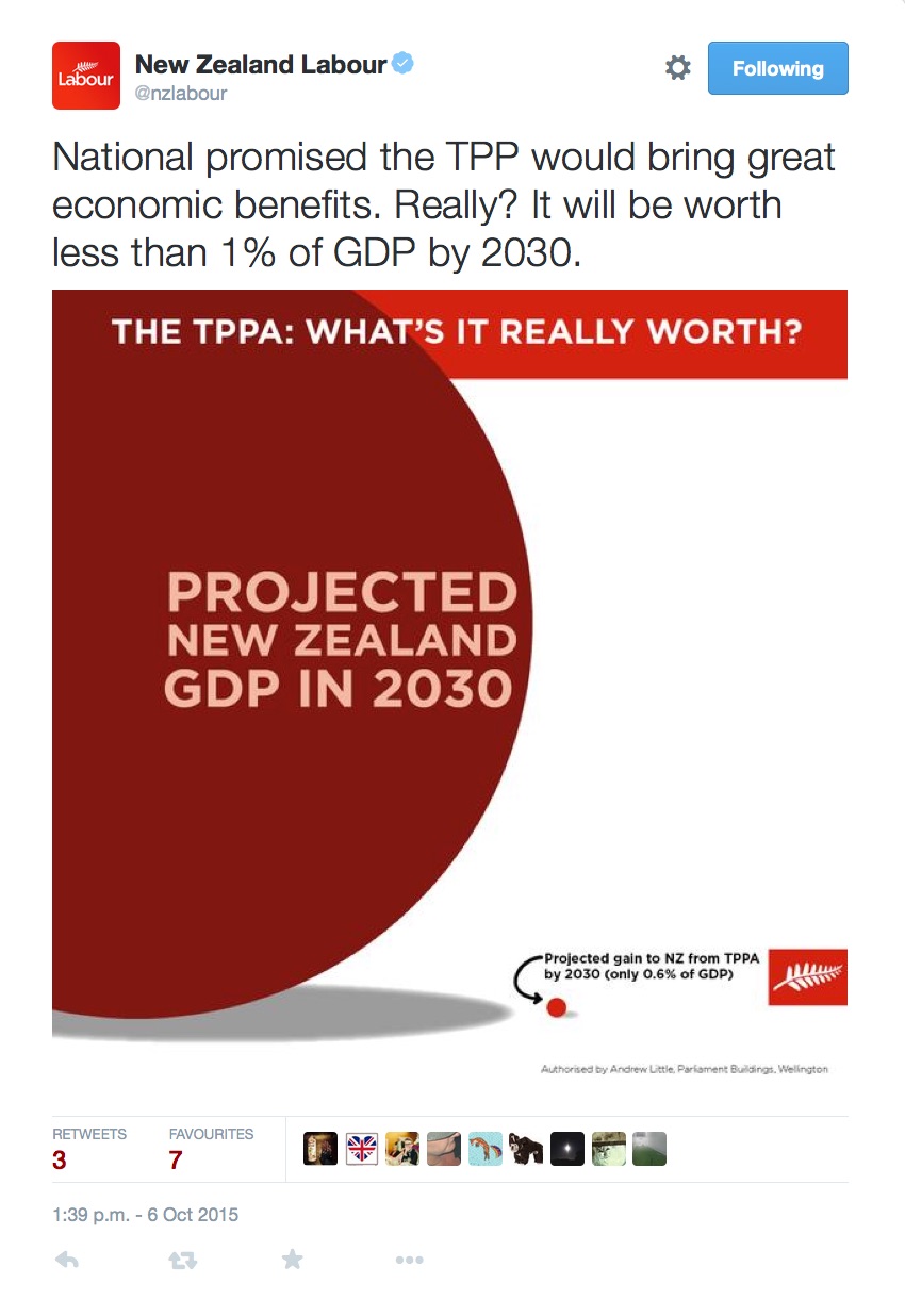
As we all know, we woke up this morning to the news that the TPPA had been agreed in Atlanta, Georgia. It is well known that this deal does not enjoy bi-partisan support. However, for the intents of this post, that is all by the by. What I want to talk about is the graphic that Labour are using to call into question the benefits of the TPPA. They have posted the same graphic on both Facebook and Twitter:


There are two, interrelated, issues that I have with the graphic. Firstly, there are no actual numbers telling you what the projected New Zealand GDP in 2030 is, nor what the projected gains, in $ terms, of the TPPA is. One user on Twitter has already called their graphic into questions.
However, this is where the bigger issue I have with the graphic raises it’s head. Once again a political party has produced a graphic, with very specific numbers being used, and they have not cited the source of the figures or information. This means that it is impossible to know if the Labour graphic, or Goody Wuthrie’s graphic display the correct relationship.
A graphic they posted earlier today has a source for the quote they used:

So it isn’t like they never do it.
Now before anyone says I am just picking on Labour over this, I will also make the same comment about this graphic from John Key’s account this morning:

This isn’t the first time I have raised this issue either, if parties really want to lift the level of debate in New Zealand, a simple place they could start is by including the source of information in their graphics, or at least in the text that goes with them.
UPDATE:
Goody Wuthrie has confirmed what his redo of the Labour graphic shows.


